The Analytics Tool My Developers Loved and My UX Team Hated
I built an analytics tool developers loved but the UX team found unusable. This experience taught me crucial lessons about building for different minds-a story about user-centric design.
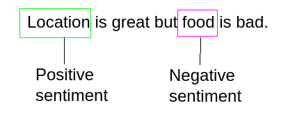
I once built an analytics app that one of our developer teams adopted almost overnight. They used it to sift through customer complaints from our aspect-based sentiment analysis (ABSA) pipeline, find pain points, and completely re-prioritize their roadmap. It was a huge success.
A few weeks later, I showed the exact same tool to our UX team. They hated it.
They ignored any screen that didn’t have a chart, got lost in jargon like “named entities,” and couldn’t find a clear path to an answer. It was a failure. The tool was powerful, but for them, it was unusable. This experience taught me a crucial lesson: you’re never building just one tool. You’re building different tools for different minds. Here’s what I learned.
Lesson 1: Developers Explore a System; Everyone Else Follows a Story
My dev team was happy to click around and figure out the system. They saw sections like “random samples” or technical terms and knew what to do with them. They were comfortable exploring a tool to understand its capabilities.
The UX team needed a guided path. Their goal wasn’t to understand the tool, but to get an answer to a question. They needed a clear, built-in narrative: a workflow that naturally led them from a high-level overview to a specific insight. Too many options without a clear path left them stuck and frustrated.
The takeaway: A tool for technical experts can be a sandbox. A tool for anyone else must be a guided tour.
Lesson 2: A Tool for Everyone Is a Tool for No One
The app’s initial success came from its sharp focus on one job: helping developers quickly surface customer pain points from sentiment data. It was designed for their specific workflow and mindset.
When I tried to make it serve the UX team’s broader research needs without changing the core design, it became vague and confusing. By trying to be useful for two very different use cases at once, it failed at both. A tool’s power comes from its purpose.
The takeaway: Define your primary user and the single most important job they need to do. Solve that problem brilliantly before you try to solve anyone else’s.
Lesson 3: Watch Clicks, Not Just Survey Responses
In surveys, the feedback from the UX team was fuzzy. But when I sat next to a designer and watched them use the tool, I saw every hesitation. I saw them ignore text-heavy screens, get confused by ambiguous buttons, and ultimately give up.
Live user testing isn’t optional; it’s where you find the truth. You learn far more by watching someone get stuck for 30 seconds than you do from a dozen written responses.
The takeaway: Your users’ real-world behavior is the ultimate source of truth. Watch them use your tool, take notes on their confusion, and fix what you see.
Putting the Lessons into Practice: Concrete UI Rules
These experiences led to some hard-and-fast rules I now apply to any analytics tool I build:
- Clearly Match Controls to Visuals. Every button, filter, and toggle should have an obvious and immediate relationship to a specific chart or data view. Ambiguity kills exploration. Aim for intuitive, unmistakable connections.
- Provide Immediate Visual Feedback. When a user clicks a button, something needs to change instantly. Instant feedback makes the tool feel responsive and alive. A lagging interface feels broken and discourages interaction.
- Don’t Underestimate Data Grids. For all the love we give complex visualizations, never forget that a clean, sortable, and filterable table is one of the most powerful data tools ever invented. People instinctively know how to use them, so make yours great.
Conclusion
The biggest mistake I made was assuming that a powerful tool would be universally useful. The developers saw a box of LEGOs and were excited to build. The UX team saw a pile of bricks with no instructions and walked away.
The ultimate test of an analytics tool is not whether it can provide an answer, but whether a busy, non-expert user will put in the effort to find it. Start there, and you’ll build something people genuinely want to keep using.