MVP Tips for Analytics Tools
Contents
Introduction
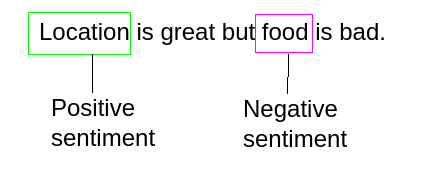
Navigating the challenges of creating a user-friendly, effective analytics tool can be daunting. This post will share real-world experiences from developing a visualization app used for aspect-based sentiment analysis (ABSA). We’ll dive into how it benefited backend and UX teams differently and offer some crucial takeaways for anyone involved in analytics tool development.

The Backstory: Meeting Different Needs with One App
Initially, I created a visualization app to explore our ABSA pipeline. It quickly gained traction among the backend team who needed to explore text messages for customer complaints. Upon applying the ABSA pipeline to a new dataset, the team found the tool extremely useful.
UX Team: A Different Story
On the flip side, the UX team had a more challenging experience. Despite having similar needs, they struggled with aspects like understanding named entities and random samples. When sitting down with them for user testing, I realized they often ignored full pages because there were no visualisations by default on the page.
What I’ve Learned
-
Be Opinionated in Design: Don’t overload your users with choices. Make intelligent decisions on their behalf to guide them toward solving their problems effectively.
-
Focus on Solving One Problem: By trying to tackle multiple issues, you risk diluting the tool’s effectiveness. Stick to solving one problem well.
-
Get Fast Feedback: Rapid feedback cycles are essential. Observe users in action, record or take notes during these user interviews, and iterate your design based on this feedback.
-
Simplify and Reuse Code: Iteration often leads to deleting code. You’ll find that a simpler solution can often do a better job, even for the original problem the code was solving.
Particular for Analytics Tools
- Be Clear About Controls and Views: Ensure that it’s clear which controls are associated with what view.
- Always Offer a Preview: Offer a preview or some cues that visualizations will be displayed when users interact with your controls like buttons and sliders. Otherwise, users might not even attempt to use them.
- Don’t Underestimate a Good Data Grid: A well-designed data grid can be a powerful tool for data analysis, so don’t underestimate its impact.
Conclusion
Creating an analytics tool that satisfies all types of users is challenging. The key is to be opinionated in your design choices, focus on solving one core problem, and continually seek user feedback for iterative improvement. Following these principles won’t just make your tool more effective; it’ll make it indispensable.
Author Bogdan
LastMod 2022-03-28