Tips for Building Effective Analytics Tools
Building interactive visualization tools for text-based customer feedback, like aspect-based sentiment analysis (ABSA), can feel daunting at first. In this post, I want to share some lessons from my time as a Machine Learning Engineer at an e-commerce company, where I built a visualization app for ABSA.
Our developer and UX teams both needed to make sense of customer feedback, but they experienced the tool in very different ways. What I learned shaped how I think about analytics tools today.
The Backstory: One App, Different Experiences
Initially, I created a visualization app to explore our ABSA pipeline, quickly gaining popularity among one of our developer teams. They found it especially valuable for analyzing customer complaints, enabling them to rapidly identify pain points and used it to change the priority of what they were building.
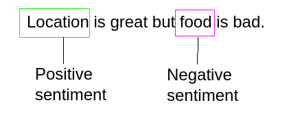
The UX team, on the other hand, had a harder time with it. Their analytical needs were similar, but the tool was full of jargon like “named entities” and sections such as “random samples” that didn’t click for them. During user testing, we noticed that any screen without an immediate visualization was usually ignored.
Essential Lessons Learned
Guide Users Through the Workflow
Too many options without a clear path leaves people stuck. Design the tool so it naturally leads users from one step to the next. The clearer the flow, the more confident they’ll feel.
Solve One Problem First
Trying to tackle every possible analytics challenge at once makes adoption harder. The app worked best when it focused purely on helping engineers surface customer pain points from sentiment data. Having a clearly defined purpose improved adoption and effectiveness dramatically.
Get Feedback While People Use It
Sitting next to someone as they use your tool teaches you far more than survey responses. Watch for hesitation or confusion, take notes, and improve based on what you see.
Keep the Codebase Lean
Each time I reused parts of the code for another analytics project, I found simpler ways to do the same thing. Cleaning up the code regularly made the app faster to build on and easier to maintain.
Special Considerations for Analytics Visualization Tools
Clearly Match Controls to Visuals
Each control (buttons, filters, toggles) should clearly correspond to a specific visualization or data view. Ambiguity can discourage users, especially those unfamiliar with your tool’s internal logic. So aim for intuitive, unmistakable connections.
Provide Immediate Visual Feedback
Ensure interactions immediately produce visible results. Users should clearly see how adjusting a control affects visualizations or data outputs. Instant feedback makes the tool feel alive and worth exploring.
Don’t Underestimate Data Grids
A well-designed grid can be one of the most powerful features in a data tool. People know how to read and sort tables, so give them a clean, responsive one.
Conclusion
Making analytics tools that work for different teams is tricky, but it’s possible. Focus on a clear workflow, solve a specific problem first, simplify your code often, and keep refining the tool through real-world use. If you do, you’ll end up with something people genuinely want to keep using.